Process documentation for Shoppingbuddy
Problem: How can we reduce the number of returns in online stores that sell clothes?
Every Norwegian buys an average of 15 kilos of clothes each year, which corresponds to a total of 63 garments. Nevertheless, half of all clothing items purchased online are returned. 70% of all returns occur as a result of the wrong size or fit. It happens because the standard sizes recommended in most online stores do not correspond to body shapes. There are big differences between people who actually use the same standard size, and that the standard sizes offered by different brands vary. The online stores lose significant resources on returns every year because employees have to spend time processing returns in addition to the fact that returned goods lose value because they cannot always be resold. On the user side, this results in the customer having a poorer self-image if the item does not fit, and loss of time from having to send the item back. Clothes that don't fit but aren't returned are eventually thrown away, leading to unnecessary waste. The return of clothing also has a negative environmental effect because it leads to increased emissionsifb transport.
Solution:
The service we develop will doshopping experiences online better and greener by delivering a machine learning technology that makes the customer experience you get from shopping in physical stores available online. We do this by being the first in our industry to deliver a full-fledged solution for online store owners that contains a"size verifier" which guarantees the right fit, and a personal online stylist who gives the customer the experience of someone who really knows them giving advice on which clothes they should choose without having to show up in the store.
Marked:
The service is aimed at small and medium-sized "multi-brand stores" that sell clothes online, that have a wide product range and a turnover of NOK 10-50 million per year and more than 5+ employees. We target online stores that carry exclusive clothing brands to users with a higher purchasing power. We target customers with this type of product range primarily because we know that expensive products are returned to a greater extent if the fit is incorrect. These companies have a lot to gain from making better purchases because exclusive garments that are returned will lose value and potentially have to be sold at a discount, resulting in lower earnings based on the purchases that have been made.
Competitor analysis:
Sizer.Me: Listed Israeli company founded in 2013 that supplies a size confirmer for body shapes that is based on a patented measurement technology using a camera. In this way, advice is given for the correct size selection, so that the number of returns is reduced and, in parallel, data is offered for better purchasing processes based on the customers' buying habits. The service can be easily integrated with its own API solutions and technical support for the customer base, which is online stores. The company has between 11-50 employees and a turnover of $6.3 million in 2022.
Read NowFit analytics: established in 2010, acquired by Snap Inc in 2021. Has offices in both Berlin and Chicago and 100+ employees. They offer a size confirmer on clothes and shoes aimed at end users at online stores. This is based on a machine learning algorithm that will provide data-driven customer insight and provides e-commerce insights to stores for smarter purchases. The service gives shops increased conversion rates on sales, and contributes to fewer returns as a result of less uncertainty linked to the choice of size. Has several large clients such as Puma, The North Face, and Tommy Hilfiger. Omatte for $13.1 million in 2022.
Read NowZizr: a Norwegian company founded in 2019, developed by Knowit. Zizr supplies a size confirmer that will remove uncertainty related to size and thus reduce the amount of clothes that are returned. Works as a plug-in on the website of online stores. Several of the large Norwegian brand stores such as Anton Sport, Follestad and Ferner Jacobsen use the service as of today. Has 4 employees. Made a loss with an operating profit of NOK -14,189 in 2022.
Read NowWhat shall shoppingbuddy do better/differently?
Where our solution differs from the competition is that we can give tips on products based on the user's appearance, like a virtual stylist.
Insight:
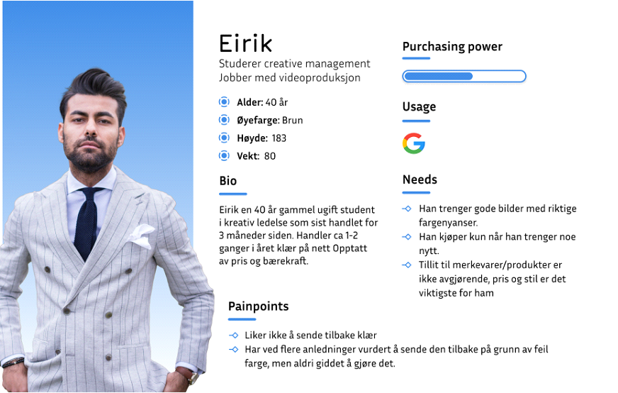
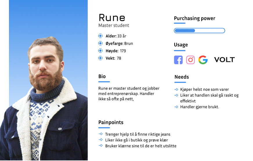
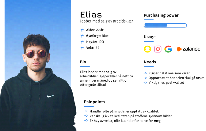
Initially, I interviewed 5 people about shopping for clothes online. What I wanted to find out was their shopping habits. what challenges arise, and how they felt about returning goods that do not fit or meet expectations. I have created 3 personas based on these interviews.
A potential customer, Northern Playground, has also been interviewed.
Northern Playground is a Norwegian clothing brand that works to actually reduce clothing consumption, by making it easier and more fun to own less.
I had a short interview with Jo Egil Tobiassen, who is the general manager and founder.
First I talked about the problem with returns of clothes that are sold online in general. I asked what this problem looked like for them.
Jo Egil said that they actually did not struggle to any particular extent with returns. He pointed to several reasons,
- They have a very local and close customer base, mainly in the Eastern part of Norway.
- Has own store in Oslo where customers often pick up the goods they buy online.
- They have even done an extra job to better clarify the sizes of the products
Then I told about our solution,
Jo Egil thought this solution could be very useful in larger online stores with a huge range of products. Especiallythe size bit I have great faith in, as I know it is a problem and causes problems for many.
For Northern Playground, which does not struggle with returns to any particular extent, and that we do not have so many different products in the range, I do not see this solution as very relevant for us.
I will also need insight into what people think and feel about leaving a picture of themselves for such a solution that I will develop.
Personas:
Idea/process:
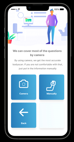
After doing research on the problem, I quickly found some companies whose vision is to reduce the number of returns in online stores that sell clothes. Some of these companies are mentioned in the competitor analysis. When I looked more closely at the different solutions, I found that the biggest variation lay in the way they got the extra data from the customers.One way to do that is to have the user enter their height, weight and age manually. Or, open the camera and take 360 video in tight clothes.
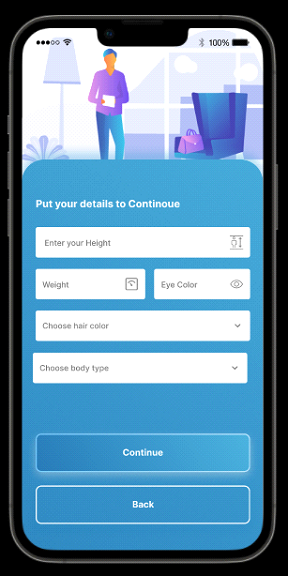
I decided to test both solutions, and do a user test more or less out of the Lo.Fi prototype. In addition, this solution needs to know the minimum eye color and hair color as well, in order to be able to give style tips based on appearance.
Lo-Fi proto: Untested appearance and layout, the purpose of the prototype was to test what users think and feel.
User test Lo-Fi:
This user test is intended as a closed test, where I want to ask what the users think and feel about leaving information about the appearance of an online store, a picture of themselves, what feelings arose during the user test.
I provide the following background information:
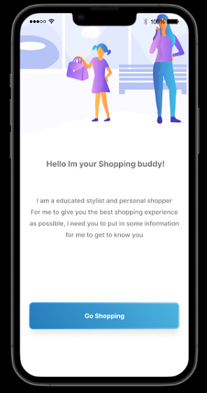
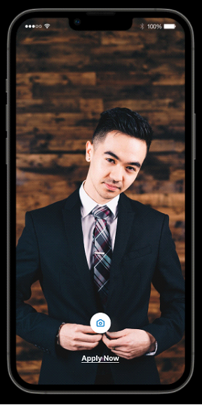
This app is designed a bit like a survey. I will create an application for online stores that sell clothes. The purpose of the application is to be able to give you the correctsize recommendation and a selection of products based on your appearance.
5 user tests were carried out, I have given a summary of the 3 most different observations:
Direct quotes:
Man 50+ (tech-educated)"
I would have been skeptical about having to undress in front of the camera", who will see the picture? AI?
If the image became a 3D avatar, read by AI, which is not a realistic image of me, then I would have gone for it.
Man 30+ (educated in entrepreneurship)"
A lot of text at the start makes me feel like it's a lot of work"
On the camera side, I miss more direct communication with the user.
Having to take a picture of yourself in underwear or something tight, I think that is too much to ask, before you have built trust in other ways.
Girl 30+ (graduated in design)"
I think this is something I could really use, if it works properly"
Personally, I would have gone to enter manually, would not have dared to leave a picture of myself in tights or panties online. The design should be in line with the online store that will use the solution.
Summary
I took this insight into the design process of the Hi-Fi prototype.
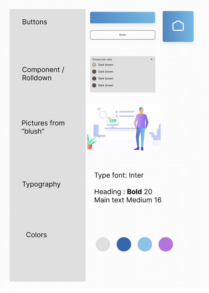
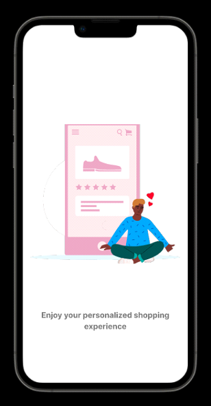
I decided to create a more subtle and universal design, go straight to the point, make it as simple as possible, but at the same time inspiring confidence. I used Blush for illustration images, used "component" to create a "drop down" menu, and focused on WCAG in the design process.
Design system:
User test of Hi-Fi prototype:
This user test is intended as a completely open test, where I observe how they choose to navigate through the application.
I provide the following background information:
This app is made for online stores that sell clothes. The idea is to be able to give you the right size recommendation and a selection of products based on your appearance.5 user tests were carried out, I have given a summary of the 5 different ones:
User 1.
Spent a lot of time reading the information in the introduction
Went to enter information manually.
It was a bit of a struggle to enter the information, quote "can I enter my own information here,
or do I have to choose something special?"
Understand the meaning of the solution.
Would use it if it is launched.
User 2
Spent little to no time reading the information in the introduction
Went to enter information manually.
Chose right of the two choices possible to choose, didn't need guidance.
Didn't understand the meaning of the solution, had to explain.
Most likely would not use the solution, shopped for very rare clothes online.
User 3
Spent some time reading the information in the introduction
Went straight for the camera solution without hesitation
After pushing through in 3-4 seconds, the person in question asked: "thats it?
"Didn't understand the meaning of the solution, had to explain.
Bruker beamed and thought this was something she didn't know she had missed
User 4
Spent little to no time reading the information in the introduction
Selected manual solution,hesitated very on the page where they could choose manual solution or photo, asked me if the camera would open if he pressed the camera button. Didn't understand the meaning of the solution, had to be explained, didn't understand that the solution could get any more information about body shape and size through a picture.Mind the design especially the pictures were very general, didn't get the feeling that it was a plugin for a webshop that sells clothes.
Would not use the solution as the user has never shopped for clothes online.
User 5
Spent a lot of time reading the information in the introduction
Chosen camera solution, quote "Wow so cool"
Understood the meaning of the solution, and thought this was something women in particular
would need, as they often have more different body shapes than men.
I thought the design was nice, easy to understand.
Would definitely have used the solution, and hoped it was something that would come to online stores in the future.
Hi-Fi prototype
Landing page:
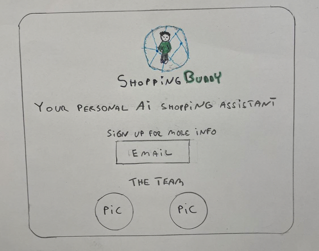
As for the landing page, I did some research on similar pages that were intended to be a small taste of something that will be launched soon.
I drew by hand a draft of how I wanted the page to look. Then I used Chat GPT to give me a few different drafts of a simple HTML and CSS layout that I could use as a starting point for designinglanding page for ShoppingBuddy. I used “Section”and “Class” in order to make the section with the images as responsive as possible. For the field where you can leave an email I used "Input" and "Form" I have named image files and checked that contrast is according to WCAG.
 Read Now
Future development plans forShoppingBuddy:
I would adjust the prototype somewhat after the user testing. A job needs to be done to make the solution even more understandable. The fact that this solution is to be used as a "plug-in" in an online store means that user interaction would come somewhat more naturally into a purchase process.
The solution will most likely have to be tailored to the individual online store where it is to be implemented. So that users do not feel this is a separate external solution, it should be designed according to the online store's existing onedesignsystem.
The Hi-Fi prototype can be further developed so that the solution actually opens the camera on the mobile phone. In this case, this must be done with a third-party solution for Figma, e.g. "protopie”
Moodboard: